
 This is a logo I did for the assemblage artwork that I do (www.artfoundango.com) in all my spare time. I really enjoy doing this kind of art and I wanted a logo for my website that reflected the artwork process itself. Since the assemblage artwork that I do uses "found objects" in the design, I tried to design the logo to look like a kind of finished assemblage art piece in itself. I'm happy with the result and I think it communicates the idea clearly.
Friday, November 28, 2008
Art Foundango
This is a logo I did for the assemblage artwork that I do (www.artfoundango.com) in all my spare time. I really enjoy doing this kind of art and I wanted a logo for my website that reflected the artwork process itself. Since the assemblage artwork that I do uses "found objects" in the design, I tried to design the logo to look like a kind of finished assemblage art piece in itself. I'm happy with the result and I think it communicates the idea clearly.
Tuesday, November 25, 2008
When Logos Collide

The Boston Globe recently launched an arts and entertainment section called, "g." The Griffin Museum of Photography who uses a logo very similar to it caught wind of it and according to Paula Tognarelli, the Museum’s executive director, the "g" logo is trademarked.
“My primary reason for calling was to say that down the line I want people to know that we did it first,” said Tognarelli. “We do have a trademarked logo, but I think they’ve altered it enough that they could use it. I’m putting a positive spin on it.”
I don't know. Looks like the letter g to me.
Saturday, November 22, 2008
The Obama Campaign Logo

Whatever direction you voted, as a graphic designer I think you have to admit that the Obama campaign logo was brilliantly executed. Here's a link to an interview that the New York Times did with the logo's designer, Sol Sender. [link]
Tuesday, November 18, 2008
Band ID: The Ultimate Book of Band Logos

This looks like a book that I would really like to add to my personal library. Note that Gerard Huerta is included in this collection (AC-DC). From the Amazon review:
From the Rolling Stones' tongue-and-lips trademark to the Grateful Dead's lightning bolt skull to Prince's glyph, logos embody an identity and experience shared between musicians and their fans, who proudly display these graphics on T-shirts, posters, pins, stickers—even tattoos. Collecting more than 1,000 rock, hip hop, metal, pop, reggae, and country music logos from the 1960s to today, this catchy design survey captures the coolest and most powerful examples of music made visual. Including interviews with key logo artists and presenting the graphics large and over extended gatefolds, BAND ID will wow music fans and designers alike.
Friday, November 14, 2008
Color us unimpressed: Montreal goes ballistic over new logo

It's been described as a, "patchwork of hot pink, tangerine, rhubarb, turquoise and green apple." Two years and $487,000 later the Montreal Metropolitan Community unveiled the region's new logo.
"I thought my neighbour's cat puked on my paper again this morning" was just one of the negative comments that citizens registered in the Gazette. The president of the design firm that created the logo was quoted as saying, ""deliberately chubby, very welcoming, like a comfy chair."
Wednesday, November 12, 2008
Gerard Huerta - Logo Designer Extraordinaire
 I think pretty much every graphic designer has someone they have looked to for inspiration through the years. Mine is an artist by the name of Gerard Huerta. Huerta began as a designer with CBS records in 1974 and left in 1976 to form Gerard Huerta Design, Inc.
 You've seen his logo design everywhere. Here's one I know you've seen (heck you probably drew it on your school book cover!). His masthead design reads as a who's who of magazines: People, Time, Money, Us.
Huerta works digitally now, but his lettering hand skills are what really blow me away. I used to letter by hand and I know how difficult it was for me to do and I am a barbarian compared to Huerta.
Herb Lubalin wrote in Print Magazine's Typography issue "Gerard Huerta, whose work is a throwback to the intricate, complicated and colorful style of the early 20th century cigar-box labels, never ceases to amaze me with the beauty of his design and technical proficiency."
Take a look at Huerta's website when you have time and meet a designer who has had a huge influence in logo design over the last 30-plus years.
www.gerardhuerta.com
Monday, November 10, 2008
When your client is you.

You probably have gathered by now that I'm a drummer. I started playing a drum kit when I was 14. You never forget your first drum kit. Mine was a gift from my parents for my birthday. It was from a Sears and Roebuck catalog and blue sparkle. It had a little shield thingy design on the bass drum head where you could paste in your initials that they sent with the kit.
Here's a picture of it. This photo was taken at my very first gig at Buda Junior High in Buda, Texas in 1969.
I figured the other day that I should have my own drum logo, so off to work I went. I started with some sketches and ended up with the logo below. I like the way the sticks made the crossbar of the letter "H" and the vertical stick made the "I" and also how it ended up looking like a clock. You know, drums, timekeeping...clock. Yeah.

Saturday, November 8, 2008
Bad case of the blues.
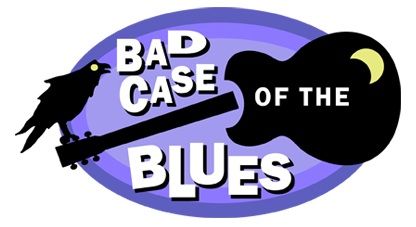
I think nothing is sadder than witnessing a guitar player breaking the neck of his treasured guitar. I've witnessed it once.
It was many years ago. He was in a band with me and we had just finished rehearsing. He decided to start spinning around in circles with the prized guitar held high over his head.
In one gut wrenching second, the guitar slipped out of his hand and crashed to the concrete floor, ending up in two splintered pieces. He wept.
How blue can you get?
This logo was designed with that scene in my mind except this was for a Pacific Northwest blues band.
Nothing says the blues better than a dark night, a broken guitar, a raven and a yellow crescent moon...and lost mojo.
Friday, November 7, 2008
Oregon Valley Boys logo chosen for LogoLounge 5
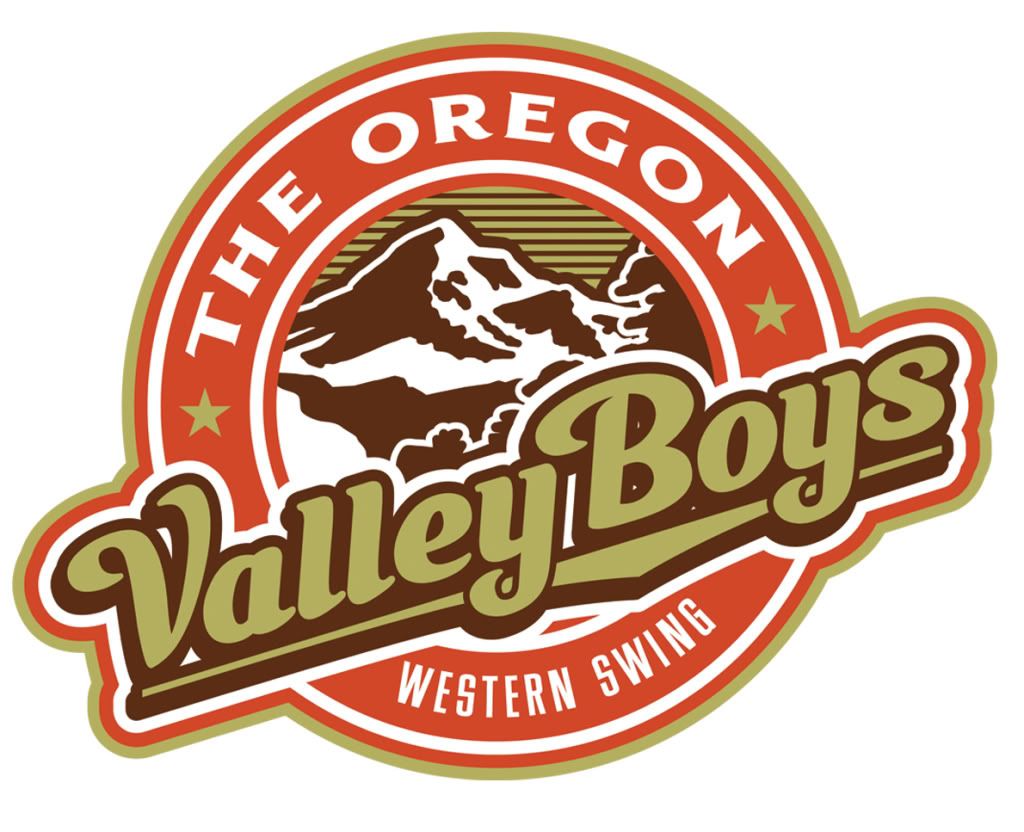
I'm very pleased (excited, astounded, bamfluzzled) to announce that the logo that my good buddy Von Glitshka and I designed for The Oregon Valley Boys (an Oregon western swing band, whose drummer shall not be named) has been chosen to be included in the new LogoLounge 5 book coming out in 2009.
It's a retro looking logo that was designed to make the band appear that it had been around for years, when in fact it's only about two years old. I think it works.
Thanks LogoLounge and a tip of the hat to Von.
Thursday, November 6, 2008
Welcome to Prefrontal Cornflakes
 So, I know you're dying to know where the name for this blog came from, aren't you? You are? Good.
I was talking to a friend one day about our amazing brain and its prefrontal cornflakes. I mean, cortex. "Wait a minute" I thought. "I like that better." It was pretty random, much like this blog will probably be. And it's also the way my brain feels most days. Kind of like a big crunchy bowl of cornflakes.
So, go into the kitchen and grab a bowl, a pitcher of milk and a spoon. Let's dig in.
Subscribe to:
Posts (Atom)

